Dining Room Banquette
Wall-to-wall storage seating built around a gallery wall, a dining table, and a family that does everything in one room
"The family's most-used room needed more storage for kids' gear — rolling carts had completely overflowed. But the wall already had a gallery wall the client loved, a dining table that needed full seating capacity, and traffic flow that couldn't be disrupted. Off-the-shelf furniture solves none of that."
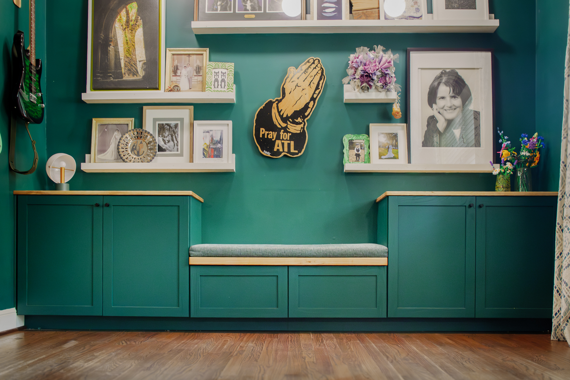
The client had a problem that’s easy to describe and deceptively hard to solve: she needed more storage, but the wall where storage made sense was already doing a lot of work. A gallery wall she loved. A dining table that needed to seat the family. Traffic flow in and out of the room. And two kids’ worth of gear currently living in rolling carts that had long since stopped being a solution.
The brief, stripped down: more storage. No lost seating. Don’t touch the art. Make it look like it belongs.
Reading the Wall
The gallery wall set the upper limit on cabinet height — go too tall and you’re blocking art. Go too short and you’re giving up storage capacity for nothing. I measured to find the height where the cabinet tops could still hold display items without the cabinets themselves eating into the wall arrangement above. That became the design constraint that shaped everything else.
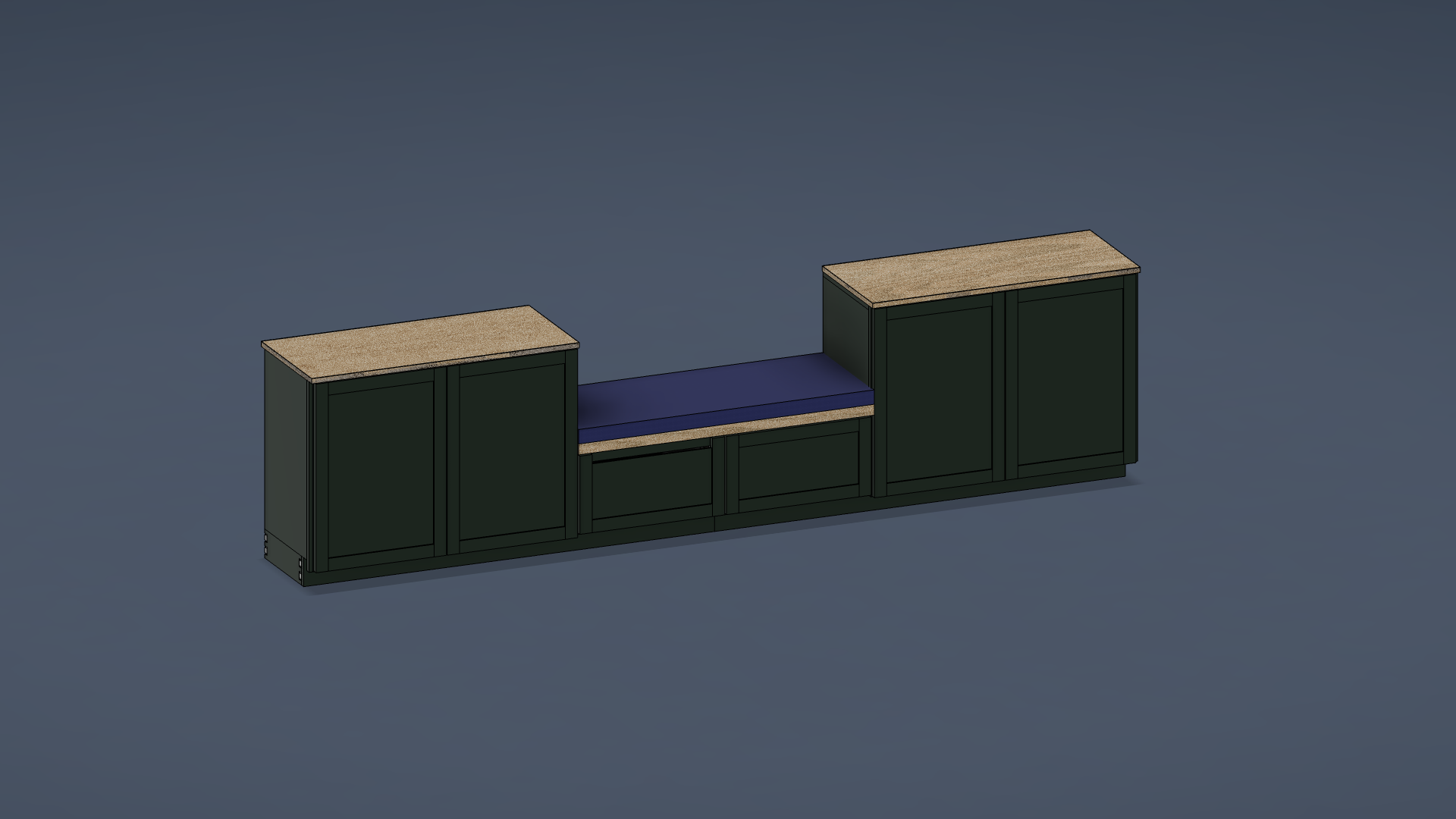
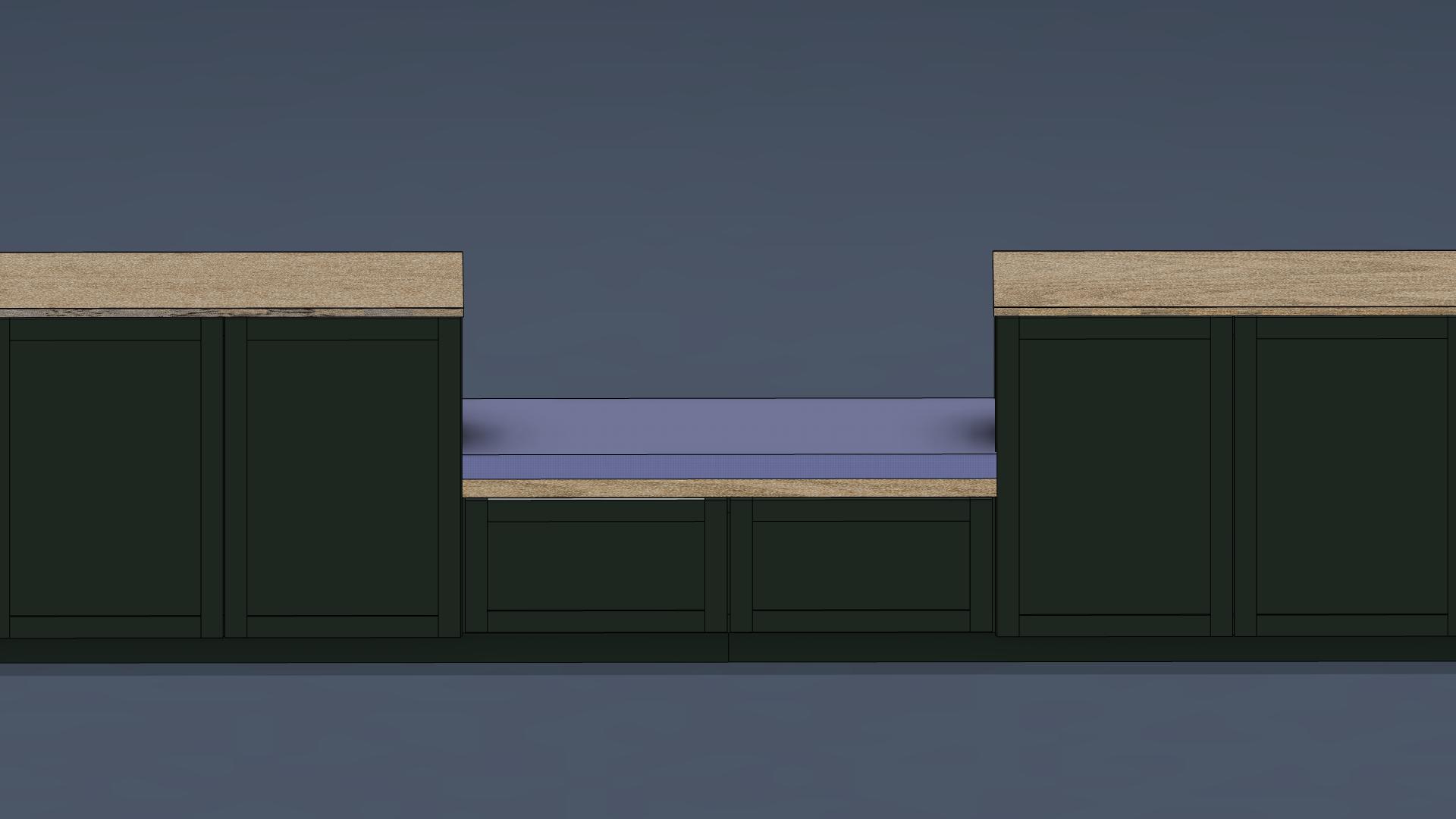
The bench section came out of the seating requirement. The client wanted full seating capacity at the dining table end without blocking the path in and out. I laid out the bench width, confirmed the clearances on both sides, and then fit the cabinet runs into what was left — maximizing depth and shelf count within the footprint.
Storage Details That Actually Matter
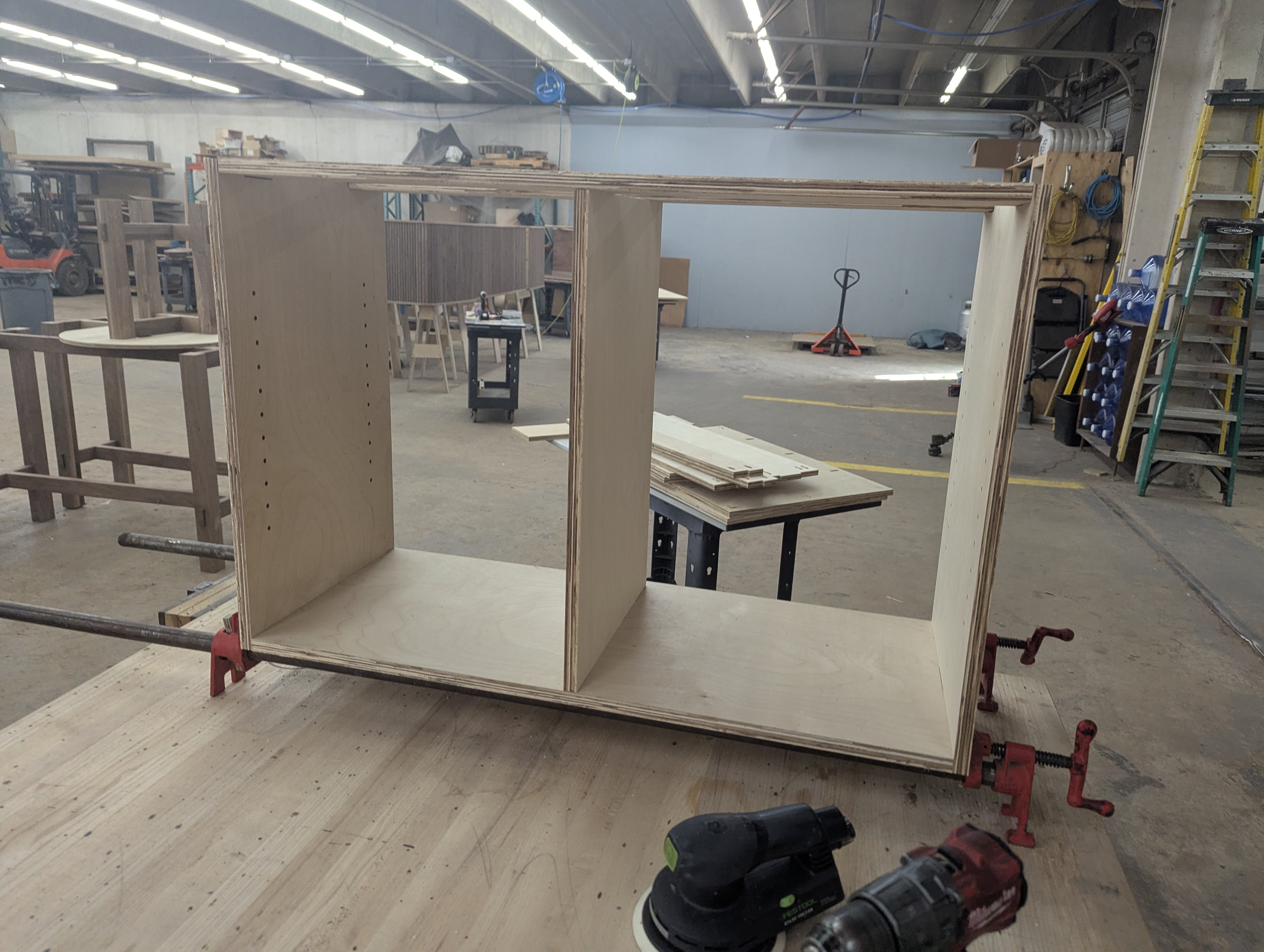
My wife works in home organization at The Oak Home, and one thing she says consistently: clients never have enough shelves. I took that seriously here. Each cabinet run got two adjustable shelves instead of one — more usable zones, more flexibility as the kids’ stuff changes over time.
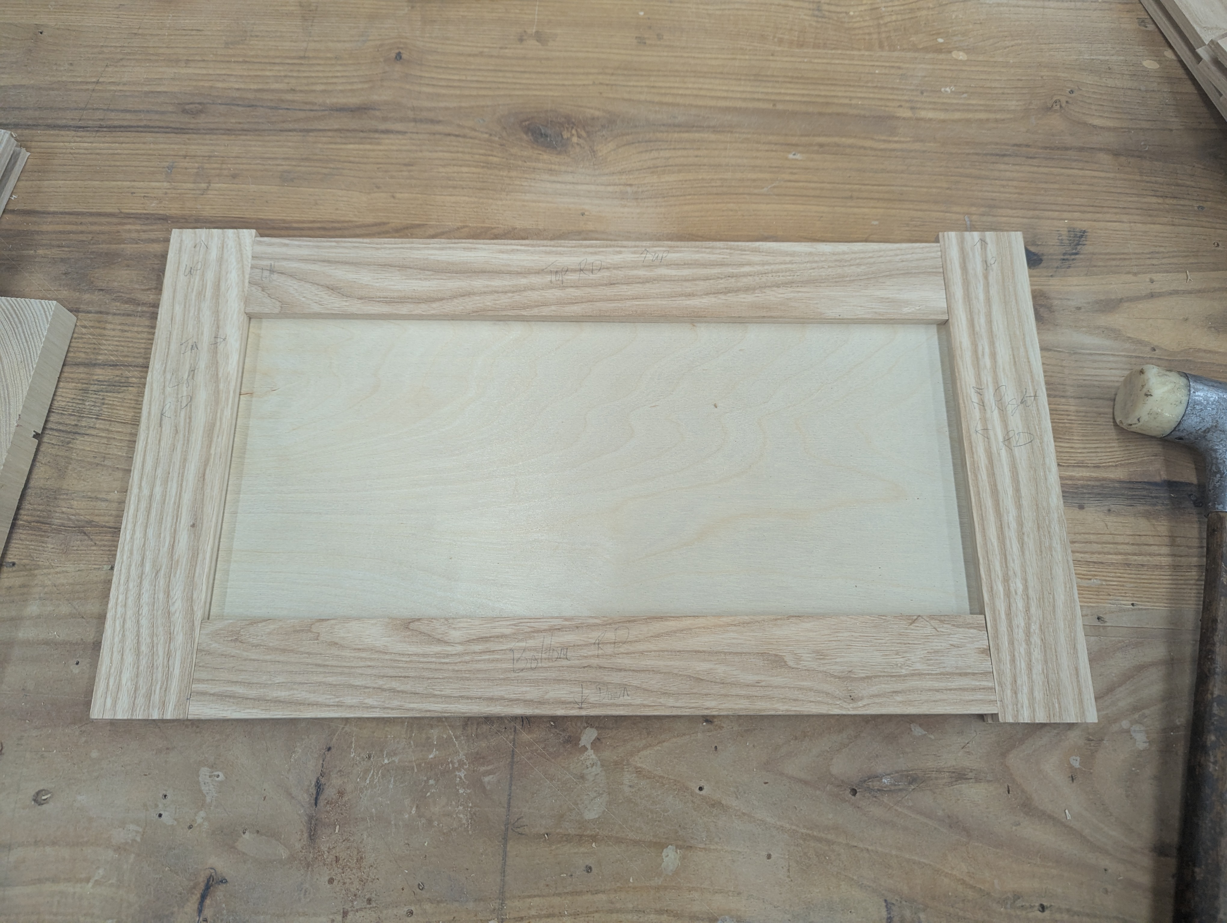
The under-bench drawers were a hardware constraint as much as a design decision. The bench section is seated height, which doesn’t leave a lot of depth below the seat. I specified drawer glides that pushed right up to the tolerance edge of the available space — fit them in, confirmed they cleared, and built around them. If I’d gone with standard hardware the drawers would have been too shallow to be useful.
Every cabinet top got a power port. The client needed power accessible along that wall, and building it in means no cords running to a strip on the floor.
Belonging in the Room
The finish decision was straightforward once I thought about it. Bringing in a contrasting color would make the piece read as furniture — something added. Matching the existing room green makes it read as architecture — something that was always supposed to be there. I matched the wall color and then used light wood for the tops and trim detail. Against the dark floors, the wood pops. Against the green cabinets and green walls, it ties everything together.
The client started moving things into the cabinets before I was done with the final walkthrough.
- Replaced overwhelmed rolling carts with enclosed cabinet storage — kid chaos has a home
- Cabinet height calibrated specifically to clear the gallery wall — art stays fully visible, cabinet tops become display shelves
- Two adjustable shelves per side rather than one — because clients never have enough shelves
- Under-bench drawers pushed to the edge of hardware tolerances to maximize storage within the layout footprint
- Power ports built into each cabinet top — wall power access preserved along the full run
- Painted to match the existing room green — looks like it was always there, not added
- Light wood tops contrast against dark floors and tie to the room's existing trim palette